Image idea
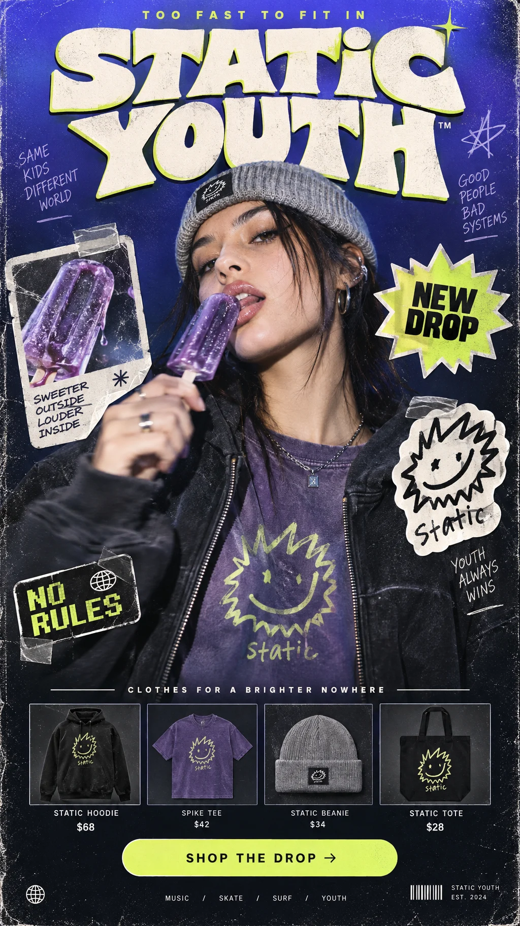
Vertical mobile-first landing page for a fictional streetwear brand called "STATIC YOUTH". Full-page poster-as-landing-page aesthetic blending Y2K skate culture, underground music flyer design, surf-street attitude and glossy youth-fashion editorial photography. Bold, energetic, irreverent and highly graphic. The page should feel like a fashion campaign, a street poster and a mobile shopping landing page all at once.
Canvas:
Vertical 9:16 mobile composition. Full-bleed background with a rich ultraviolet-to-midnight gradient, fading from saturated electric indigo at the top (#4A52D9) into deep near-black navy at the bottom (#121A2C). Add subtle film grain, faint CRT warmth, soft vignette around the edges and a lightly distressed print texture for authenticity.
Top banner:
At the very top, a small tracked uppercase sans-serif line in bright acid-lime:
"TOO FAST TO FIT IN"
Directly below, a massive bold chunky wordmark in off-white with a soft warm tint:
"STATIC"
Below it, slightly overlapping or tucked in, the second word:
"YOUTH"
Typography should be heavy, playful and loud — somewhere between a chunky slab-serif and an early-2000s skate zine masthead. The letters should feel slightly irregular and hand-adjusted, with subtle tilt and misalignment. Add a dimensional shadow / puff-print / beveled effect in neon-lime to make the lettering pop. Tiny glossy highlight streaks on some letter edges, as if screen-printed ink catches the light.
Central hero photograph:
Dominating the composition, filling roughly 60% of the vertical layout: a cinematic chest-up portrait of a stylish young person with a cool, detached, self-aware expression. Their head is tilted slightly upward and to one side, giving a casual, confident streetwear attitude.
Wardrobe:
- A washed charcoal oversized zip hoodie worn open or half-zipped.
- Underneath, a faded violet graphic tee.
- A soft light-grey knitted beanie or close-fitting cap.
- Optional subtle silver chain or ear cuff for added styling.
Front graphic on the tee or hoodie:
An original mascot-style symbol: a scribbly hand-drawn spiky oval character in neon-lime with two dot eyes and a crooked half-smile, slightly weird and charming, completely original and not resembling any existing brand mascot. Inside or just below the glyph, the handwritten text reads:
"static"
The model holds a translucent purple ice-pop near the mouth, as if about to bite it, with a playful smirk. One hand can show slight motion blur, as though caught in a spontaneous playful movement. The ice-pop becomes a color accent in the layout.
Photography style:
Shot like a premium streetwear campaign with soft frontal lighting, subtle cool rim-light from the sides, realistic skin texture and a light layer of film grain. The image should feel editorial and authentic, not overly retouched, with a slight Y2K snapshot sensibility.
Sticker-style graphic overlays:
Scatter 3–4 DIY sticker graphics over the photo and surrounding areas, arranged like collaged peel-off vinyl stickers.
Sticker 01 (upper-right):
A bright acid-lime starburst sticker with bold condensed text:
"NEW DROP"
Small, slightly rotated, with a thin white outline and soft drop shadow.
Sticker 02 (middle-left):
A rounded sticker containing a close-up crop of the purple ice-pop, like a magazine clipping. White outline, slightly tilted, subtle taped-corner detail.
Sticker 03 (middle-right or lower-right):
A sticker featuring the original scribbly mascot symbol — the spiky oval face with dot eyes and crooked smile, plus the tiny handwritten word "static". The sticker should look screen-printed and slightly scuffed.
Sticker 04 (optional, near lower-left):
A small sticker with the phrase:
"NO RULES"
in pixel-style or compact bold sans-serif lettering.
All stickers should have a handmade collage quality, with subtle white borders, faint cast shadows and slight rotation. Some may appear as if taped onto the page.
Mid